import numpy as np
import matplotlib.pyplot as plt
from matplotlib.colors import ListedColormap
import matplotlib.patches as patches
from matplotlib.patches import Rectangle
import seaborn as sns

# Set style for better plots
plt.style.use('default')
sns.set_palette("husl")Introduction
Effective visualization is crucial for understanding satellite imagery and geospatial data. This cheatsheet covers essential plotting techniques.
Creating Sample Satellite Data
def create_sample_satellite_scene(size=256):
    """Create a realistic-looking satellite scene"""

    # Create coordinate grids
    x = np.linspace(0, 10, size)
    y = np.linspace(0, 10, size)
    X, Y = np.meshgrid(x, y)

    # Simulate different land cover types
    # Water bodies (low values)
    water = np.exp(-((X - 2)**2 + (Y - 7)**2) / 2) * 0.3
    water += np.exp(-((X - 8)**2 + (Y - 3)**2) / 4) * 0.25

    # Forest/vegetation (medium-high values)
    forest = np.exp(-((X - 6)**2 + (Y - 8)**2) / 8) * 0.7
    forest += np.exp(-((X - 3)**2 + (Y - 2)**2) / 6) * 0.6

    # Urban areas (varied values)
    urban = np.exp(-((X - 7)**2 + (Y - 5)**2) / 3) * 0.8

    # Combine and add noise
    scene = water + forest + urban
    noise = np.random.normal(0, 0.05, scene.shape)
    scene = np.clip(scene + noise, 0, 1)

    # Scale to typical satellite data range
    return (scene * 255).astype(np.uint8)

# Create sample scenes for different bands
red_band = create_sample_satellite_scene()
green_band = create_sample_satellite_scene() * 1.1
blue_band = create_sample_satellite_scene() * 0.8
nir_band = create_sample_satellite_scene() * 1.3

print(f"Band shapes: {red_band.shape}")
print(f"Data ranges - Red: {red_band.min()}-{red_band.max()}")
Band shapes: (256, 256)
Data ranges - Red: 0-255Single Band Visualization
fig, axes = plt.subplots(2, 2, figsize=(12, 10))

# Different colormaps for single bands
cmaps = ['gray', 'viridis', 'plasma', 'RdYlBu_r']
band_names = ['Grayscale', 'Viridis', 'Plasma', 'Red-Yellow-Blue']

for i, (cmap, name) in enumerate(zip(cmaps, band_names)):
    ax = axes[i//2, i%2]
    im = ax.imshow(red_band, cmap=cmap, interpolation='bilinear')
    ax.set_title(f'{name} Colormap')
    ax.axis('off')
    plt.colorbar(im, ax=ax, shrink=0.8)

plt.suptitle('Single Band Visualization with Different Colormaps', fontsize=14)
plt.tight_layout()
plt.show()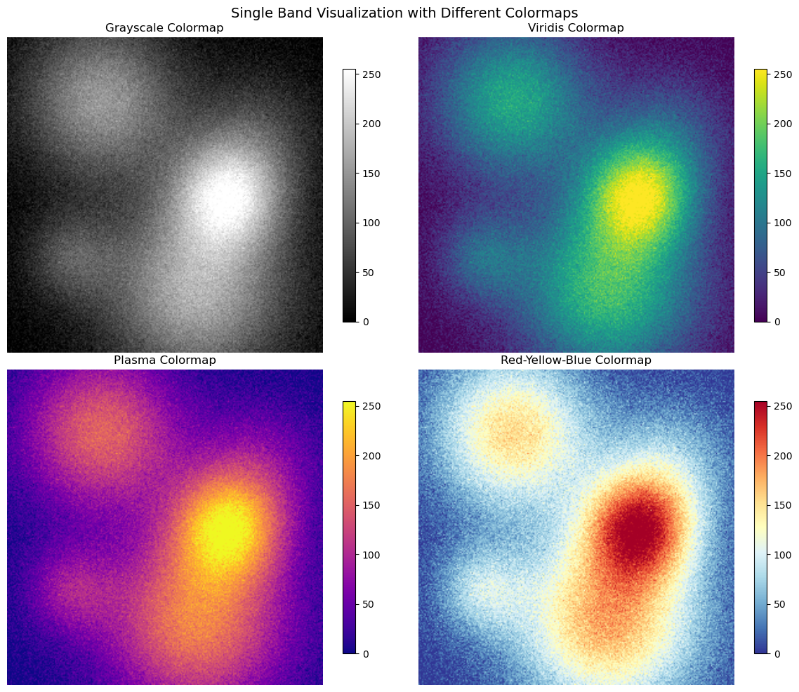
RGB Composite Images
def create_rgb_composite(r, g, b, enhance=True):
    """Create RGB composite with optional enhancement"""

    # Stack bands
    rgb = np.stack([r, g, b], axis=-1)

    if enhance:
        # Simple linear stretch enhancement
        for i in range(3):
            band = rgb[:,:,i].astype(float)
            # Stretch to 2-98 percentile
            p2, p98 = np.percentile(band, (2, 98))
            band = np.clip((band - p2) / (p98 - p2), 0, 1)
            rgb[:,:,i] = (band * 255).astype(np.uint8)

    return rgb

# Create different composites
true_color = create_rgb_composite(red_band, green_band, blue_band)
false_color = create_rgb_composite(nir_band, red_band, green_band)

fig, axes = plt.subplots(1, 2, figsize=(15, 6))

axes[0].imshow(true_color)
axes[0].set_title('True Color Composite (RGB)')
axes[0].axis('off')

axes[1].imshow(false_color)
axes[1].set_title('False Color Composite (NIR-Red-Green)')
axes[1].axis('off')

plt.tight_layout()
plt.show()
Clipping input data to the valid range for imshow with RGB data ([0..1] for floats or [0..255] for integers). Got range [0.0..255.0].
Clipping input data to the valid range for imshow with RGB data ([0..1] for floats or [0..255] for integers). Got range [0.0..255.0].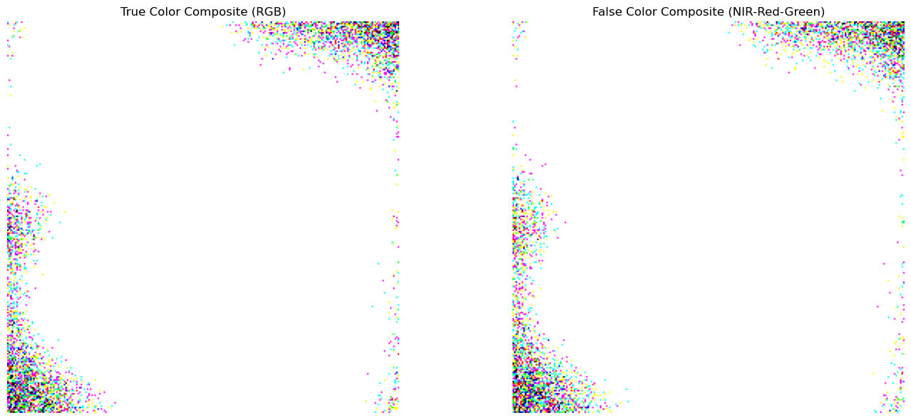
Spectral Indices Visualization
# Calculate NDVI
def calculate_ndvi(nir, red):
    """Calculate Normalized Difference Vegetation Index"""
    nir_f = nir.astype(float)
    red_f = red.astype(float)
    return (nir_f - red_f) / (nir_f + red_f + 1e-8)

# Calculate other indices
ndvi = calculate_ndvi(nir_band, red_band)

# Water index (using blue and NIR)
ndwi = calculate_ndvi(green_band, nir_band)

fig, axes = plt.subplots(1, 3, figsize=(18, 5))

# NDVI
im1 = axes[0].imshow(ndvi, cmap='RdYlGn', vmin=-1, vmax=1, interpolation='bilinear')
axes[0].set_title('NDVI (Vegetation Index)')
axes[0].axis('off')
plt.colorbar(im1, ax=axes[0], shrink=0.8)

# NDWI
im2 = axes[1].imshow(ndwi, cmap='RdYlBu', vmin=-1, vmax=1, interpolation='bilinear')
axes[1].set_title('NDWI (Water Index)')
axes[1].axis('off')
plt.colorbar(im2, ax=axes[1], shrink=0.8)

# Histogram of NDVI values
axes[2].hist(ndvi.flatten(), bins=50, alpha=0.7, color='green', edgecolor='black')
axes[2].set_xlabel('NDVI Value')
axes[2].set_ylabel('Frequency')
axes[2].set_title('NDVI Distribution')
axes[2].grid(True, alpha=0.3)

plt.tight_layout()
plt.show()

print(f"NDVI range: {ndvi.min():.3f} to {ndvi.max():.3f}")
print(f"NDVI mean: {ndvi.mean():.3f}")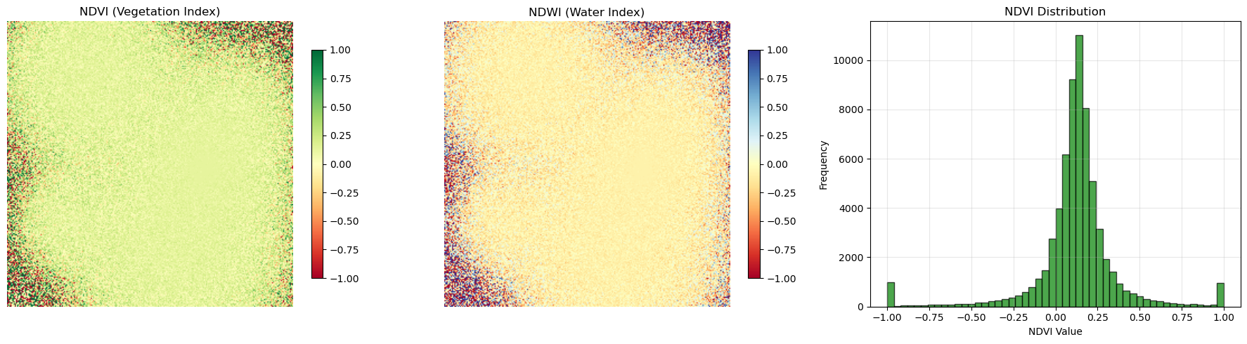
NDVI range: -1.000 to 1.000
NDVI mean: 0.121
Custom Colormaps and Classification
# Create land cover classification
def classify_land_cover(ndvi, ndwi):
    """Simple land cover classification"""
    classification = np.zeros_like(ndvi, dtype=int)

    # Water (high NDWI, low NDVI)
    water_mask = (ndwi > 0.3) & (ndvi < 0.1)
    classification[water_mask] = 1

    # Vegetation (high NDVI)
    veg_mask = ndvi > 0.4
    classification[veg_mask] = 2

    # Bare soil/urban (low NDVI, low NDWI)
    bare_mask = (ndvi < 0.2) & (ndwi < 0.1)
    classification[bare_mask] = 3

    return classification

# Classify the scene
land_cover = classify_land_cover(ndvi, ndwi)

# Create custom colormap
colors = ['black', 'blue', 'green', 'brown', 'gray']
n_classes = len(np.unique(land_cover))
custom_cmap = ListedColormap(colors[:n_classes])

fig, axes = plt.subplots(1, 2, figsize=(14, 6))

# Show classification
im1 = axes[0].imshow(land_cover, cmap=custom_cmap, interpolation='nearest')
axes[0].set_title('Land Cover Classification')
axes[0].axis('off')

# Custom legend
from matplotlib.patches import Patch
legend_elements = [
    Patch(facecolor='black', label='Unclassified'),
    Patch(facecolor='blue', label='Water'),
    Patch(facecolor='green', label='Vegetation'),
    Patch(facecolor='brown', label='Bare Soil/Urban')
]
axes[0].legend(handles=legend_elements, loc='upper right')

# Classification statistics
unique_classes, counts = np.unique(land_cover, return_counts=True)
percentages = counts / counts.sum() * 100

axes[1].bar(['Unclassified', 'Water', 'Vegetation', 'Bare/Urban'][:len(unique_classes)],
           percentages, color=['black', 'blue', 'green', 'brown'][:len(unique_classes)])
axes[1].set_ylabel('Percentage of Pixels')
axes[1].set_title('Land Cover Distribution')
axes[1].grid(True, alpha=0.3)

for i, (cls, pct) in enumerate(zip(unique_classes, percentages)):
    axes[1].text(i, pct + 1, f'{pct:.1f}%', ha='center', va='bottom')

plt.tight_layout()
plt.show()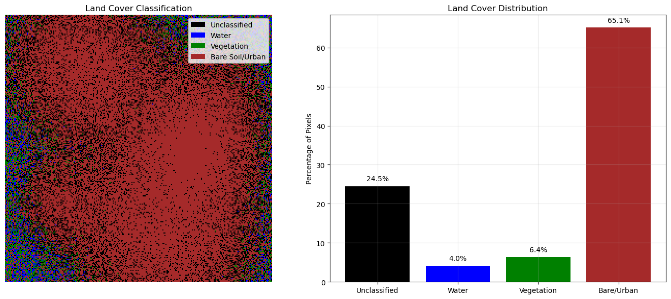
Advanced Visualization Techniques
# Multi-scale visualization
fig, axes = plt.subplots(2, 3, figsize=(18, 12))

# Full scene
axes[0, 0].imshow(true_color)
axes[0, 0].set_title('Full Scene')
axes[0, 0].axis('off')

# Add rectangle showing zoom area
zoom_area = Rectangle((100, 100), 80, 80, linewidth=2,
                     edgecolor='red', facecolor='none')
axes[0, 0].add_patch(zoom_area)

# Zoomed areas with different processing
zoom_slice = (slice(100, 180), slice(100, 180))

# Zoomed true color
axes[0, 1].imshow(true_color[zoom_slice])
axes[0, 1].set_title('Zoomed True Color')
axes[0, 1].axis('off')

# Zoomed false color
axes[0, 2].imshow(false_color[zoom_slice])
axes[0, 2].set_title('Zoomed False Color')
axes[0, 2].axis('off')

# Zoomed NDVI
im1 = axes[1, 0].imshow(ndvi[zoom_slice], cmap='RdYlGn', vmin=-1, vmax=1)
axes[1, 0].set_title('Zoomed NDVI')
axes[1, 0].axis('off')
plt.colorbar(im1, ax=axes[1, 0], shrink=0.8)

# Zoomed classification
axes[1, 1].imshow(land_cover[zoom_slice], cmap=custom_cmap, interpolation='nearest')
axes[1, 1].set_title('Zoomed Classification')
axes[1, 1].axis('off')

# Profile plot
center_row = land_cover.shape[0] // 2
profile_ndvi = ndvi[center_row, :]
profile_x = np.arange(len(profile_ndvi))

axes[1, 2].plot(profile_x, profile_ndvi, 'g-', linewidth=2)
axes[1, 2].axhline(y=0, color='k', linestyle='--', alpha=0.5)
axes[1, 2].axhline(y=0.4, color='r', linestyle='--', alpha=0.5, label='Vegetation threshold')
axes[1, 2].set_xlabel('Pixel Position')
axes[1, 2].set_ylabel('NDVI Value')
axes[1, 2].set_title('NDVI Profile (Center Row)')
axes[1, 2].grid(True, alpha=0.3)
axes[1, 2].legend()

plt.tight_layout()
plt.show()
Clipping input data to the valid range for imshow with RGB data ([0..1] for floats or [0..255] for integers). Got range [0.0..255.0].
Clipping input data to the valid range for imshow with RGB data ([0..1] for floats or [0..255] for integers). Got range [36.0..255.0].
Clipping input data to the valid range for imshow with RGB data ([0..1] for floats or [0..255] for integers). Got range [36.0..255.0].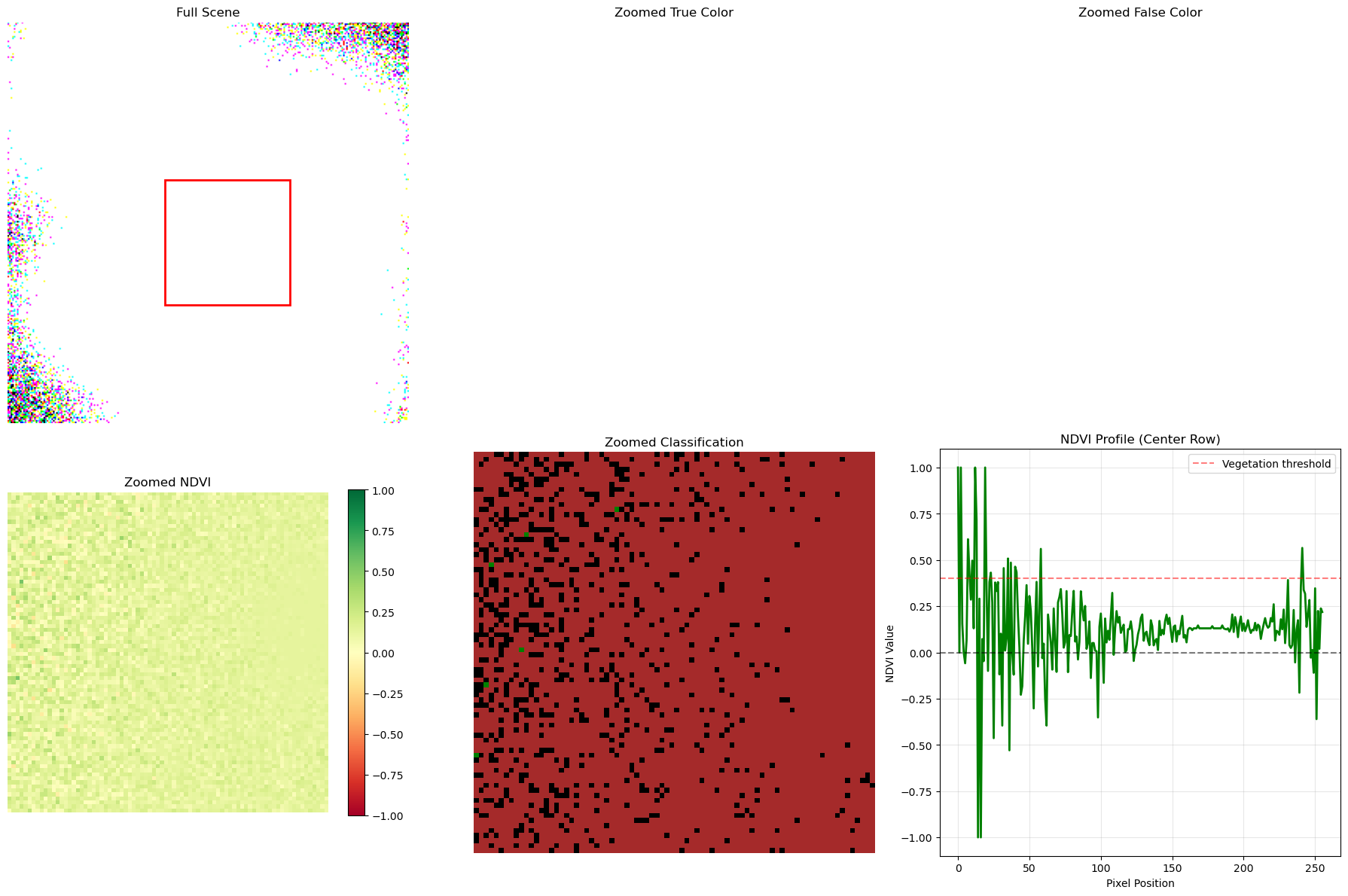
Time Series Visualization
# Simulate time series of NDVI
def create_ndvi_time_series(n_dates=12):
    """Create sample NDVI time series"""
    dates = []
    ndvi_values = []

    # Simulate seasonal pattern
    base_ndvi = 0.4
    seasonal_amplitude = 0.3

    for i in range(n_dates):
        # Simulate monthly data
        month_angle = (i / 12) * 2 * np.pi
        seasonal_component = seasonal_amplitude * np.sin(month_angle + np.pi/2)  # Peak in summer
        noise = np.random.normal(0, 0.05)

        ndvi_val = base_ndvi + seasonal_component + noise
        ndvi_values.append(ndvi_val)
        dates.append(f'Month {i+1}')

    return dates, ndvi_values

# Create sample time series for different land cover types
dates, forest_ndvi = create_ndvi_time_series()
_, cropland_ndvi = create_ndvi_time_series()
_, urban_ndvi = create_ndvi_time_series()

# Adjust for different land cover characteristics
cropland_ndvi = [v * 0.8 + 0.1 for v in cropland_ndvi]  # Lower peak, higher base
urban_ndvi = [v * 0.3 + 0.15 for v in urban_ndvi]  # Much lower overall

plt.figure(figsize=(12, 6))

plt.plot(dates, forest_ndvi, 'g-o', label='Forest', linewidth=2, markersize=6)
plt.plot(dates, cropland_ndvi, 'orange', marker='s', label='Cropland', linewidth=2, markersize=6)
plt.plot(dates, urban_ndvi, 'gray', marker='^', label='Urban', linewidth=2, markersize=6)

plt.xlabel('Time Period')
plt.ylabel('NDVI Value')
plt.title('NDVI Time Series by Land Cover Type')
plt.legend()
plt.grid(True, alpha=0.3)
plt.xticks(rotation=45)
plt.ylim(-0.1, 0.8)

# Add shaded regions for seasons
summer_months = [4, 5, 6, 7]  # Months 5-8
plt.axvspan(summer_months[0]-0.5, summer_months[-1]+0.5, alpha=0.2, color='yellow', label='Summer')

plt.tight_layout()
plt.show()

# Print some statistics
print("NDVI Statistics by Land Cover:")
print(f"Forest - Mean: {np.mean(forest_ndvi):.3f}, Std: {np.std(forest_ndvi):.3f}")
print(f"Cropland - Mean: {np.mean(cropland_ndvi):.3f}, Std: {np.std(cropland_ndvi):.3f}")
print(f"Urban - Mean: {np.mean(urban_ndvi):.3f}, Std: {np.std(urban_ndvi):.3f}")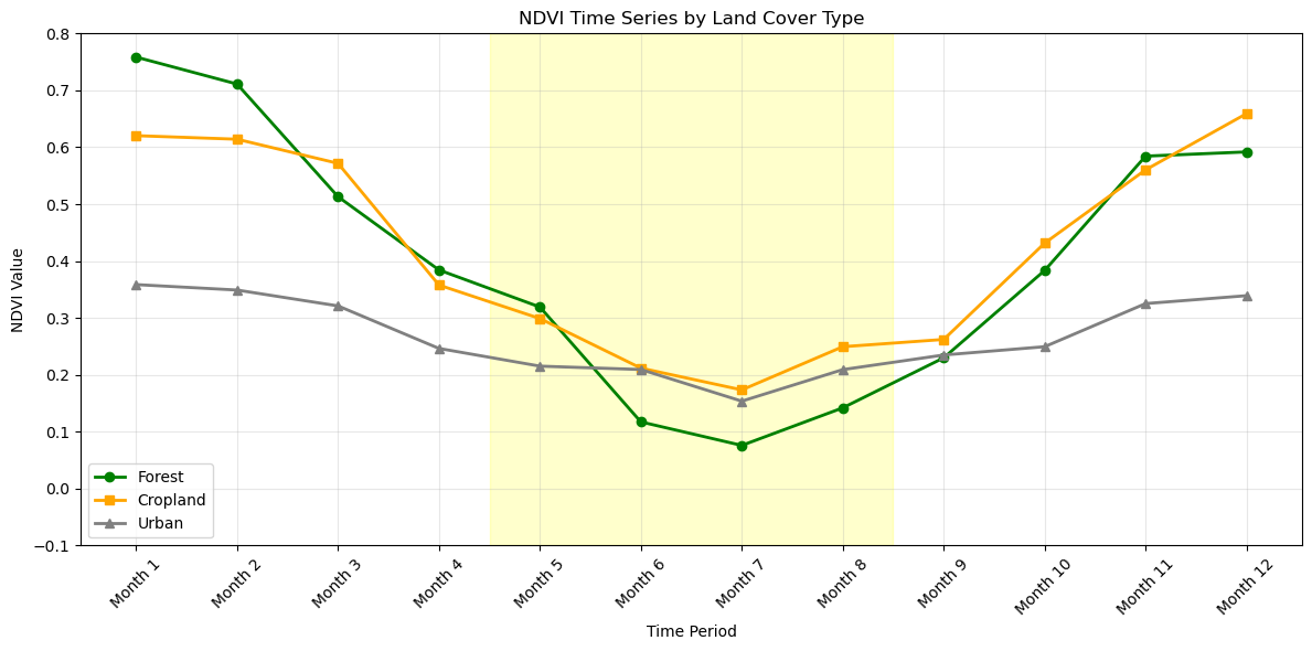
NDVI Statistics by Land Cover:
Forest - Mean: 0.401, Std: 0.223
Cropland - Mean: 0.418, Std: 0.172
Urban - Mean: 0.268, Std: 0.065
Summary
Key visualization techniques covered:
- Single band visualization with different colormaps
- RGB composite creation and enhancement
- Spectral indices (NDVI, NDWI) visualization
- Custom colormaps and classification maps
- Multi-scale visualization with zoom and profiles
- Time series plotting for temporal analysis
These techniques form the foundation for effective satellite imagery analysis and presentation.